c44329 No.13767194
The above images show the original (smooth lightning at pixelart resolution), a lower resolution gradient, and banding levels of lightning. Do any of these make the (supposedly dynamic) smooth lightning worth it? Or is it a lost cause and looks like shit regardless?
original thread broke before I could ask this question
d9c0cb No.13767209
Use the smooth lighting in that particular case. It flows best without making the background distract from the fore. The third option looks like a literal mess of shit.
cb42bd No.13767214
>>13767194
First one looks good.
Second is mixels.
Third is awful. Who looked at that and decided it was worth showing?
05d754 No.13767227
Better:
Remove pixelshit from existence.
ae9162 No.13767229
1 looks too clean
2 looks ok but the lighting being a different resolution than the rest triggers me
3 looks a bit convoluted but also the most stylish and atmospheric
c44329 No.13767284
>>13767229
so a compromise between 1 & 2 would be the best?
9dc22f No.13767300
f71fe2 No.13767309
Why are you remaking my thread?
c44329 No.13767331
>>13767309
It's a derivation. I got curious how to make the smooth gradient work. Flat coloring the BG isn't good.
297aac No.13767359
>not just dithering it to a palette
Although it wouldn't work too well if there's dynamic lights, you'd have to dither it on the fly, which means you'll definitely want to use a shader for best performance. And only type of dithering you can use with a shader is ordered dithering, which looks like shit. No Floyd-Steinberg or anything decent.
ac2a54 No.13767373
I like 3 the best. Fits the aesthetic the most.
1 is way too smooth.
2 is too janky.
47599a No.13767387
Possibly something like three with dithering.
69d52a No.13767389
why are there multiple shadows being cast backwards onto the wall to which the lights are affixed?
all of the lights and shadows look awful.
f77388 No.13767398
Unless you can fix 3 to look less shit, if go with 1.
f24de7 No.13767404
>>13767194
>there are people in this thread saying 3 looks the worst
Summer came early this year.
6b47a6 No.13767405
I'd go with 1st, often these effects were made through dithering on CRTs, even well into the psx era, it was always smoothed like in the first pic;
I don't know who would even want 2, and 3 would be ok too but you need a plan to not make it look bad on certain areas
53d664 No.13767436
I like 3.
Are the pics from an actual game? I'd play it.
f6b0ee No.13767450
>>13767436
It's Mistyk Belle, but pretty sure anon modified the pics.
192e70 No.13767526
Don't use lighting systems period, just individually sprite different lighted sprites.
c44329 No.13767533
Ok this time I have a pixelated BG whose resolution isn't jarring, and a nicer to look at band lighting.
>>13767450
Yes.
03b715 No.13767534
>>13767404
>>13767194
The dithering on pic 3 looks like too much noise if you ask me. But it's definitely not the worst one. The worst looking one is definitely pic number 1. Pic number 3 is in the middle and pic 2 is probably the best. Pic 2 seems to strike a balance between art-style and smoothness.
13d4c3 No.13767537
>>13767526
This. Sprites with alpha, or full screen alpha masks.
03d54e No.13767538
3 is best. If you want it to look smoother, add more steps from light to dark or try something like dithering.
Don't ever use 1 or 2 unless you WANT to be an indie shitter. Gradients like that do not belong with pixel art, it looks extremely lazy every time I see it.
03b715 No.13767546
>>13767534
>dithering
fuck I meant banding, which is the polar-opposite of dithering. Please don't bully I got my terms mixed up
8dc34a No.13767547
>>13767194
2 is a mess. 1 is safe but 3 is more stylish.
Really need to see them in motion. Get some gentle pulsating on 3 and it'd be really something.
6c5b59 No.13767568
None of that looks real pixel-perfect color lighting.
Hive Jump is the only game I know that did it right.
11cd23 No.13767572
All of these suck. You should use 3, but only have a light and dark color, not that retarded gradient shit.
60a75e No.13767577
3 is amazing, 1 and 2 and alright
c44329 No.13767591
>>13767568
normal maps? looks cool.
b3f2df No.13767802
>>13767194
1 looks good, the rest look gay.
28f880 No.13767817
>>13767533
First one looks good.
c44329 No.13767821
Any ideas about these updated ones? >>13767533
768cac No.13768605
>>13767194
At first glance I found 3 to be the worst, but after consideration, it's just pretty stylish. Needs a webm comparing the three in motion though.
768cac No.13768610
>>13767533
Both are nice but I'm leaning toward the first.
30a602 No.13768621
>>13767194
>Smooth lightning in pixelshit.
If you absolutely must then go with 3.
>>13767533
First one. Easy choice.
461424 No.13768634
2d games with lighting did it 3 ways. Lit, shadowed, and semi transparent. If you are using more than 3 for a background, you are doing it wrong.
823337 No.13768950
>>13767194
Smooth is fine, it's basically just more pixels anyway right?
846129 No.13768999
>>13767194
I like 1.
Terraria had the options between 1 and 2 though.
c676c1 No.13769039
Unless you can do >>13767568 this, the best solution may be the simplest one: just put a meshed transparency around whatever is supposed to generate light. Like something you'd actually see on a SNES game, I guess.
311adc No.13769092
>>13767568
And here you have a perfect example of the usual pixelshit cocksucker. It's overdesigned as shit. The entire screen is filled with shit that serves no purpose. It's beyond cluttered. Enemy attacks come out of nowhere and are essentially impossible to see before they're too close to dodge because of all the visual noise. Enemy gibs flying everywhere, the pointlessly flashy laser, the enemies themselves, the death splash (bonus point for being the same color as the projectiles they throw), all the shit over the ground. It's a perfect example of why modern pixels are called pixelshit; they just cram as much shit onto the screen as they can with zero regards for visibility and how it affects the gameplay. You can't even tell what the fuck the enemies are.
The lightening. Why the fuck does the entire level flash in every color of the rainbow every time you fire the gun? Another example of the pixelshit mentality; "we can do these things so therefore it's a good idea". It's completely pointless, looks like absolute shit and hurts visibility like nothing else. Look at the second gif with the boss. Instead of giving the boss actual telegraphed attacks, they make tiny parts of it flash before suddenly shitting out shots. Which is kind of fucking awful design WHEN THE ENTIRE BOSS AND SCREEN IN GENERAL ARE FLASHING ALL THE TIME.
All the sprites except the gigantic boss that takes up half the screen are
unclear, hideous messes of gray. The characters can't be told apart at just a glance, despite the game being designed to be played in multiplayer and the sprites being tiny. No regard was given to the gameplay. Everything was designed around the screen flashing in colors at all time and nothing else was given even a second of thought.
This is exactly why pixels today are called pixelshit. It's 100% style over substance. They didn't want to make a game when designing the graphics, they wanted to make something as flashy as possible while (ab)using pixels because triple A HD shit is too difficult. Games are supposed to be played you stupid fucking cunts. You can make them look good but you have to do it while keeping visibility in mind. And even if that wasn't an issue, the game still looks like dog shit because it's just constantly flashing colors and a screen that is cluttered with pointless things. If you think this is an example of good use of pixels you're clueless and outright objectively wrong.
f52dc6 No.13769389
>>13767194
Pick a restricted color palette, stick to it. That will make you think wisely about your color and shading.
3a10dc No.13769419
>>13767533
The shadows make no fucking sense
6d033d No.13769436
>>13767568
>rotated pixels
>anti-aliased pixel fonts
>different pixel sizes
>smooth shading
>did it right
fd0755 No.13769456
>>13767194
Neither. Use dithering you fuckwit.
30a602 No.13769488
>>13769456
This is the real correct answer.
58a765 No.13769540
>>13767194
First one looks obviously the best. Why the fuck would you want either of the two? Just to make your game look "retro"?
34ec56 No.13769553
>>13768999
Yo trips, is Terraria worth playing in single player? I'm not for multishit.
c87b02 No.13770290
>>13769456
This is a derivation of a thread where the OP was criticized for his smooth lighting BG in a pixel game. I tried to photoshop alternatives that could be a compromise between gradients and solid color walls. I've updated the 3 original ideas ito >>13767533 and it's starting to look like the banded light is preferred to a lower res gradient.
0f7d53 No.13770301
>people think pic 2 looks good with those GIANT chunky shadows that are way bigger than all the other pixels
1 looks the best right now, but 2 would be greatly improved if it wasn't so fucking low-res.
30a602 No.13770336
>>13769553
Terraria is better in single than in multi because it really isn't balanced for multi.
>>13770290
If you really want to hit all the right notes then the best thing to do would be to apply dithering to the banding via a shader. But only if you can make it pixel perfect otherwise just stick with banding.
87e3a9 No.13770349
1st one looks good, 2nd one looks OK but the banding is really obvious and shouldn't be present, 3rd looks like absolute garbage.
30a602 No.13770478
>>13770349
If you saw 1 or 2 in actual motion then they would look like complete shit. 3 is the best out of all of them.
Personally I'm against using modern type dynamic lighting in pixel games. Pseudo dynamic lighting can look nice though.
f78aba No.13770888
The center is best but all three are trash, stop letting lighting mangle the resolution of your drawing. Be consistent.
c87b02 No.13771040
>>13769456
Dithering? shit I didn't think of that!. Here's the current 2 options plus 3 dithering levels.
spent way too long on this.
a6e0c2 No.13771291
>>13771040
A is shit tbh, the dithering looks much better
57cbbc No.13771338
>>13771040
Is this even a question? Obviously the dithering is superior.
c87b02 No.13771390
>>13771291
>>13771338
which dither though?
a6e0c2 No.13771581
>>13771390
6 colours looks fine
8e738d No.13771681
Generate normal maps for your sprites and use those for lighting, don't bother with shadows.
d2e16c No.13771736
Has wayforward ever made a game that wasn't a 2D platformer?
pic unrelated
b3f2df No.13776867
>>13769540
You're supposed to believe the third looks better to earn pretentious hipster faggot points.
b696db No.13777051
pixels and smooth kinda contradicts each other imo
3>2>1
e50b97 No.13777326
>>13767194
1 is cool but I think it detracts from the feel. 2 is a mess. 3 looks kind of bad in this picture but I feel that it would work well in motion.
2653ce No.13777377
>>13776867
>>13769540
If you want to completely disregard the pixel grid and color limits why even bother making it pixel art to begin with?
795b1f No.13777413
>>13767194
1st one is best
1aaff2 No.13777543
YouTube embed. Click thumbnail to play.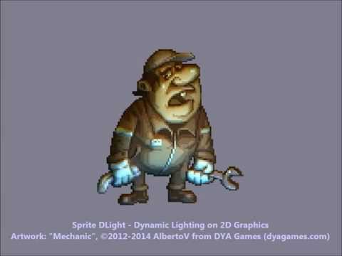
Shadows look like shit, do this instead
5330a2 No.13777556
Hand made animated sprites would make best shadows in pixelshit. Like hand made frame by frame animation.
Stop being lazy
147db6 No.13778622
>>13771390
Is it possible to make it an option? Ideally you can design around what you decide on but give the option for players to change the number if they prefer something else.
2f950c No.13778641
>>13771040
6 color dithering.
4 color is too pixelated and kind of clashes with the sprites art style.
10 color is a bit too smooth and I feel the sprites are blending into the background.
389cd9 No.13788080
>>13777543
Yeah, but then you'd have to either:
>A: Create a normal maps for everything by hand, and that's a lot of work.
<B: Auto-generate normal maps and have most of them look really weird.
And even then, they'll always look kind of weird since they aren't actual 3D, so there's all kinds of weird quirks to it.